Wes Anderson doesn’t just make movies-he builds worlds. Every frame feels like a diorama you could walk into, where colors are deliberate, symmetry is sacred, and every prop has a story. Between The French Dispatch (2021) and Asteroid City (2023), his visual language didn’t evolve-it deepened. These two films aren’t just sequels in style; they’re variations on a theme, each pushing his signature aesthetic into new emotional territory.
The French Dispatch: A Magazine Made of Film
The French Dispatch is structured like a New Yorker issue, with three stories and a cover piece. Anderson uses this format to play with perspective. Each segment has its own color palette, aspect ratio, and animation style. The first story, about a prison artist, uses muted blues and grays with occasional bursts of red. The second, a student uprising, is shot in stark black-and-white with handheld chaos-something Anderson rarely allows. The third, a chef’s love letter, drips in warm yellows and browns, like an oil painting from a 1950s French café.
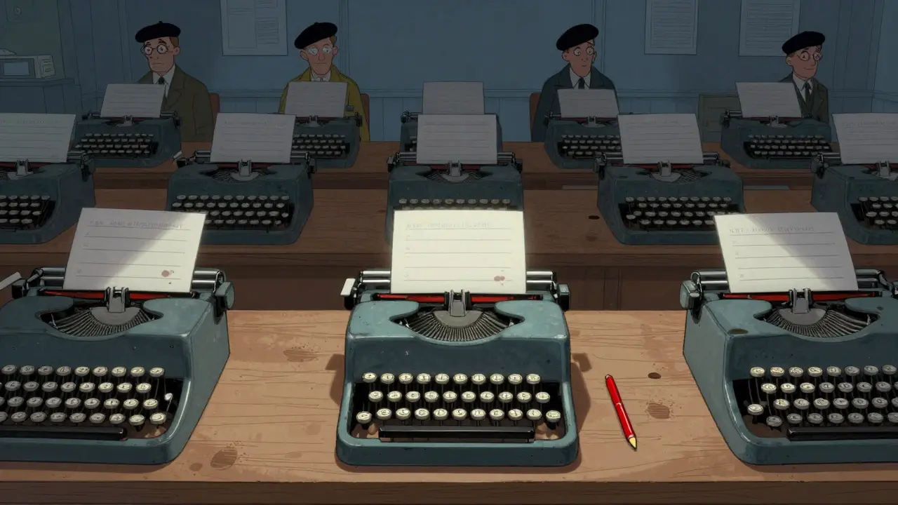
The sets here are hyper-detailed. Think of the typewriter in the newsroom: every key is worn just right, every ink smudge placed like a fingerprint. Even the background characters have distinct wardrobes. A waiter in the opening scene wears a vest with three buttons missing. That’s not a mistake-it’s character design.
Anderson’s camera moves like a museum curator. It glides, tilts, and pans with surgical precision. There are no shaky cam moments, no zooms for drama. The lens observes, never intrudes. In one scene, a character walks down a hallway while two others argue behind glass. The camera stays still. The argument happens in the background. The walk happens in the foreground. Both matter equally.
Asteroid City: A Desert of Symmetry and Sorrow
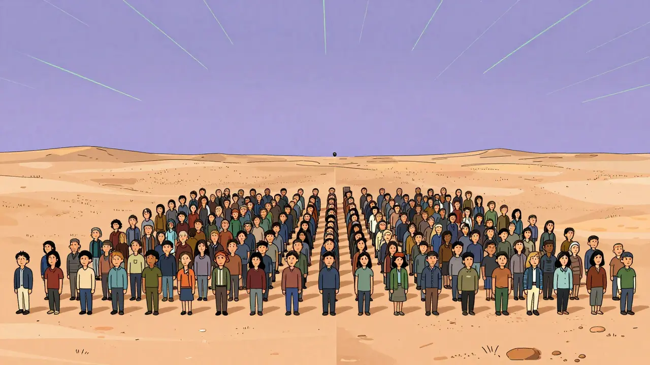
Asteroid City takes place in a 1950s desert town built entirely for a junior science fair. The town is a perfect grid. Every building is the same height. Every street is the same width. Even the cacti are planted in evenly spaced rows. It’s artificial. It’s beautiful. And it’s deeply lonely.
The color scheme here is all pastels-mint greens, baby blues, dusty pinks. It’s the kind of palette you’d find in a 1955 toy catalog. But beneath the candy coating is grief. The entire town is mourning a dead astronaut. The characters wear smiles like masks. Their dialogue is polite. Their silences are heavy.
Anderson uses stop-motion for the film-within-a-film narration. The narrator’s voice is calm, almost bored. The puppets move with robotic precision. It’s a deliberate contrast to the messy, emotional lives of the characters. The stop-motion isn’t just a stylistic choice-it’s a metaphor. These people are puppets of a society that values order over feeling.
One of the most striking scenes is the meteor shower. The sky glows with green streaks. The townspeople stand in perfect rows, staring upward. No one speaks. No one cries. They just… watch. The camera pulls back slowly. The town becomes a single dot on a map. The universe doesn’t care about their grief. Anderson doesn’t either. He just shows it.
Side-by-Side: How the Styles Diverge
Both films use symmetry, but for different reasons. In The French Dispatch, symmetry is about control-journalists trying to make sense of chaos. In Asteroid City, symmetry is about repression-people hiding pain behind perfect lines.
Color usage differs too. The French Dispatch uses bold, saturated tones to signal genre shifts. Asteroid City uses muted pastels to create emotional distance. One feels alive with energy. The other feels like a memory you can’t quite touch.
Costumes tell their own story. In The French Dispatch, characters wear period-accurate suits, berets, and trench coats. Each outfit is tailored to their role. In Asteroid City, everyone wears the same uniform: pastel shirts, khaki shorts, and matching shoes. It’s not fashion-it’s conformity.
The camera work shows the biggest shift. In The French Dispatch, Anderson uses split screens, zooms, and layered compositions to mimic magazine layouts. In Asteroid City, he uses long, unbroken takes. One scene lasts over four minutes with no cuts. The camera doesn’t move. The actors do. The tension builds not from editing, but from stillness.
Why This Matters: The Psychology of Aesthetics
Anderson’s style isn’t just pretty. It’s psychological. His symmetry creates order in stories where order is broken. His color choices aren’t decorative-they’re emotional cues. Red in The French Dispatch means passion. Pastel pink in Asteroid City means repression.
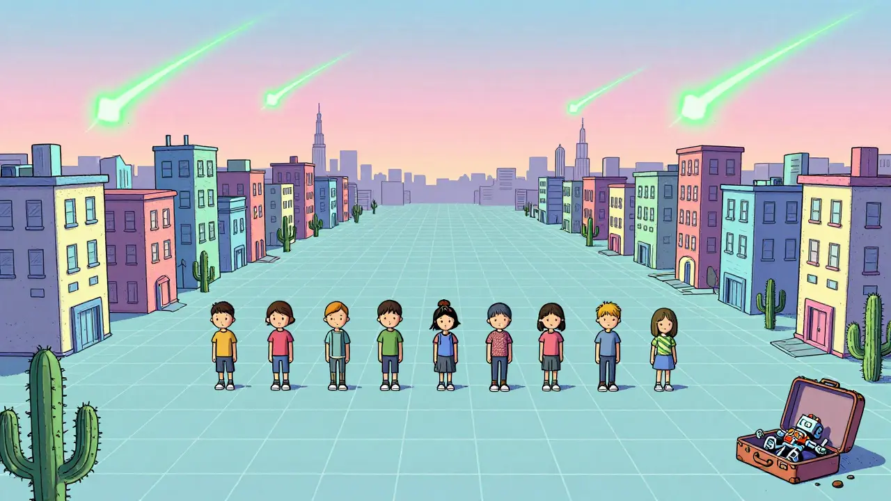
His sets are built to be lived in, not just looked at. In The French Dispatch, a character’s apartment has 17 books on a shelf. Each spine has a different title. In Asteroid City, a child’s suitcase has a single toy inside: a broken robot. That’s all we need to know about their family.
Anderson doesn’t tell you how to feel. He builds a world so precise, so carefully composed, that you can’t help but feel something. The silence in Asteroid City isn’t empty. It’s full of unspoken grief. The clutter in The French Dispatch isn’t messy-it’s alive with ideas.
The Legacy: What These Films Say About Modern Cinema
Most filmmakers chase realism. Anderson chases truth through artifice. He knows that sometimes, the most honest moments happen in the most artificial settings. A perfectly aligned row of chairs can say more about loneliness than a crying scene.
These two films prove that visual style isn’t just decoration. It’s narrative. The way a door opens. The angle of a hat. The color of a wall. These aren’t random choices. They’re dialogue.
Anderson’s work in these films feels like a response to the chaos of modern life. In a world of algorithms and noise, he offers stillness. In a world of clutter, he offers clarity. You don’t just watch his movies-you sit inside them. And when you leave, you notice how messy everything else looks.
What’s Next for Wes Anderson?
He’s already announced his next project: a stop-motion film set in 1920s Prague. Rumors say it’ll be his most personal yet. If Asteroid City is about grief, and The French Dispatch is about memory, then Prague might be about time-how we hold onto it, how we lose it, and how we try to make it beautiful.
One thing’s certain: he won’t repeat himself. He’ll build another world. And you’ll want to live in it.
Is Wes Anderson’s style the same in all his films?
No. While he keeps core elements-symmetry, color palettes, and meticulous set design-each film adapts those elements to fit the story. The French Dispatch uses shifting styles to mimic magazine sections. Asteroid City uses uniformity to reflect emotional repression. His style evolves with the narrative, not the other way around.
Why does Wes Anderson use so much symmetry?
Symmetry in Anderson’s films isn’t just aesthetic-it’s emotional. It creates a sense of control in stories where characters feel out of control. In Asteroid City, the perfect town contrasts with the chaos of grief. In The Royal Tenenbaums, the symmetry hides family dysfunction. The order is a mask.
Are the colors in Wes Anderson’s films random?
Absolutely not. Every color is chosen deliberately. In The French Dispatch, red appears during moments of passion or violence. In Asteroid City, pastels create emotional distance. Anderson works with production designers to pick colors that match the psychological state of the scene, not just the time period.
Do Wes Anderson’s films have a specific time period?
They’re often set in the mid-20th century-1950s to 1970s-but they’re not historical. They’re nostalgic. Anderson blends elements from different decades to create timeless worlds. Asteroid City looks like 1955, but the dialogue and music feel like they’re from 1968. It’s not about accuracy-it’s about mood.
Is Wes Anderson’s style too artificial?
It’s intentionally artificial. Anderson believes real emotion is often hidden behind polished surfaces. A perfectly arranged room can feel more truthful than a messy one. His style doesn’t hide truth-it reveals it through contrast. The more controlled the world, the louder the silence between the words.